top of page
Fresh Grocer Self Checkout:
a/b Testing
designed three distinct design solutions to the Fresh Grocer self checkout machine with an Invision prototype of a clickable index sheet
Scope: 2 weeks
Role: Solo project. Conducted user research, created wireframes and prototypes
Tools: Figma, Invision
Problem: Fresh Grocer is the closest and most accessible grocery store on Penn's campus, not only to students, but also to faculty and families that live in the West Philadelphia neighborhood. Although it is open for 24 hours and provides the service of multiple self checkout machines, there are constantly a long line for this use. How might we better enhance the design of these machines to decrease the time wasted standing in line?
Solution: The Fresh Grocer self checkout machine displays three distinct design solutions. Based on user preferences and habits, much of the time spent using the machine is on searching for produce items when customers must punch in the item code or search up the item in the catalog. The solutions below exhibit 3 ways of sorting these items:
1. Popular Items, with fruits and vegetables on the left sidebar
2. Fruits and Vegetables, with popular items on the left sidebar
3. All items alphabetically with popular items on the left sidebar
These design methods better empathize with those who are unfamiliar with the many types of produce, and overall decrease the time spent in grocery stores.
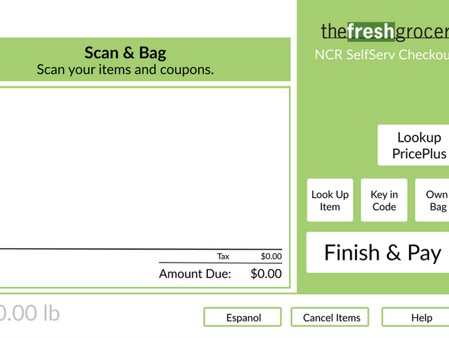
The Original Design:
Design 1: Popular Items
This design filters produce items by placing the most popular among customers in the middle of the screen in alphabetical order. For users that are buying items outside of these, they are given the option of looking for their item on the left sidebar under the categories of fruits and vegetables or by searching directly for their item in the search bar.
*The flow below shows the process of buying a Gala apple, where the user clicks on Apple Gala from the popular items.
Design 2: Fruits & Vegetables
This design filters produce items by placing the two most popular categories (fruits and vegetables) in the middle of the screen and then sorting items by generic type. For example, when looking for a Gala Apple, the user can first tap on fruits, then apple, and is then presented with the multiple types offered in stores. This design also accommodates to those who are unfamiliar with the specific types as it presents the price of the apples.
*The flow below shows the process of buying a Gala apple, where the user clicks on Apple Gala from the fruits tab.
Design 3: Alphabetically
This design sorts all produce items alphabetically in the center of the screen and places popular categories on the left side. For example, when looking for a Gala Apple, the user can first tap on A-B, then apple, and is then presented with the multiple types offered in stores. This design also accommodates to those who are unfamiliar with the specific types as it presents the price of the apples.
*The flow below shows the process of buying a Gala apple, where the user clicks on A-B from the center screen tab.

bottom of page


